Uncategorized

Moves

Image

Moves is quickly becoming one of my favourite apps. It’s one I installed as soon as I switched to my Nexus 4. I open Moves maybe once a day. Twice, at best. Moves does its magic in the background. I don’t have to do anything except carry my phone with me.

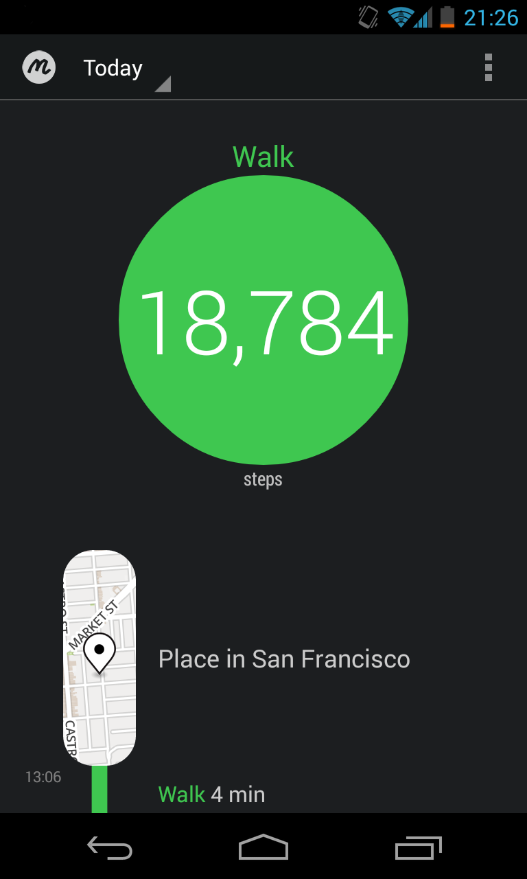
I hit a new record today! 18,784 steps AKA 3 hrs and 13 min of walking AKA 12.9 km.

No, these numbers aren’t monumental. However, they do a wonderful job of satisfying my curiosity, giving me a relative indication of my activity. I can feel the app slowly modifying my behaviour. I opened it today while I was heading to a train station, saw what I was at, and thought, “screw it, I’ll walk a few blocks to the next one.”

Continue reading

Standard
Uncategorized

Going Back in iOS 7

I’ve been playing with the iOS 7 beta for the past few hours and the “Back” gesture is easily my favourite thing about iOS 7.

The translucency is nice. The buttons not looking like buttons is for the most part not even an issue when you’re actually using the thing, because, you know, there’s other ways to highlight that like colour, weight, and people still read labels. The structure and placement is also obviously similar to previous iOS versions. It does feel cramped at times for sure in the Navigation Bar. I will say the Game Center log in button is horrendous.

Continue reading

Standard
Uncategorized

Android niceties: One year on

It’s been a year and two days since I started Android niceties. What a year it’s been!

The site began as an experiment in Tumblr, and got going with this rather misguided post on /r/Android. Considering some of the apps I chose to initially include and the lack of customisation I put into the base theme, it’s little wonder that I got slammed in the comments. There was more than enough encouragement there though.

I plodded on, and woke up to a flurry of emails on December 2, 2011 when Matias Duarte, the head of Android Design shared it on Google+. Then The Next Web a couple of days later, and Gizmodo Brazil a week after that.

The introduction of the official Android Design site by Google earlier this year has really helped Android apps to begin forging their own direction and visual identity. The action bar, the typography, the minimalism. I think it’s safe to say apps look uniquely Android now. Even scrolling through the site in the last five months, you see that coming through loud and clear. 

Continue reading

Standard
Uncategorized

Trialling NetBank Vault for Android – #NetBankLab

Commonwealth Bank are piloting their NetBank Vault app on Android. I got to try it this weekend.

Oh, what is it?

It’s a secure online storage service where you can upload, organise and manage all of your files and documents. Think of it like a personal virtual safe deposit box; store receipts, payslips, photos, you get the idea.

I’ve become a heavy Dropbox user lately, and I’m using Google Drive too, for the extra storage space. They’re both pretty similar in their functionality, and both their Android apps are slick.

tl;dr Vault has a long way to go.

The login screen

Media_httpiimgurcomxs_kvqpd


The labels above the fields really aren’t needed, and unnecessarily clutter the screen. Tumblr and Pocket are two examples of apps I’ve seen recently that do it cleanly.

Continue reading

Standard
Uncategorized

Android UI unification in Ice Cream Sandwich

Well, this post by Min Ming on Android UI fragmentation has certainly been doing the rounds today, and while there is no doubt that UI fragmentation across Android, and even some of their Google-branded offerings exists, instead of looking at how it’s headed in a positive direction, the post chose to pick on some disparate cases. Hey, it wasn’t made up, and the point stands, but below are how the core Google apps in Ice Cream Sandwich are doing things right in terms of unification, and setting a standard developers and UI dudes and dudettes can certainly use as examples.

By the way, Google, you can do SO MUCH MORE to make things easy for developers in providing some rigid guidelines, and ultimately, for your end users, getting accustomed to a consistent experience across the OS and applications. I mean, really, how hard is it to set up some UI patterns like Android Patterns.

Click to embiggen images! This reduced size view does their gloriousness no justice.

Tabs

Tab_bar

The More icon AKA the new Menu

More

Continue reading

Standard
Uncategorized

A few hours in, some quick, inane thoughts on the Galaxy Nexus and Ice Cream Sandwich

After what seemed like eons, I finally got a Galaxy Nexus in my hand, and I can safely say that this is a most triumphant marriage of hardware and software!

To be honest, I actually haven’t done a lot with the phone, and apart from reaching for the Menu button in the first few minutes, I feel completely at home. Everything looks a little different, and in some cases, more than a little different, but in every case, as of now anyway, it’s for the better.

I’ll save the screenshot walkthrough for another time, but I’ve got some of the new Gmail app over on Android niceties.

Continue reading

Standard
Uncategorized

Kaching and Android. I’m a little confused…

The Commonwealth Bank launched Kaching today.

Kaching

You’ll see quite a few comments in that thread—including my fail—questioning why there wasn’t an Android release, or when it was coming, and CBA responded in that thread, and Andrew Lark replied to me on Twitter saying…

…coming soon. Will launch at same time or close to Apple version. We are committed to both.

I was sated. To be fair, they also mentioned that 91% of mobile visits are from iPhone and Android, of which 79% are from the iPhone. This will change over time, but is a rather compelling argument to go iPhone first.

Then I started reading ZDNet’s Inside CommBank’s Kaching post, and the page on Android confused me.

Continue reading

Standard
Uncategorized

Initial thoughts on Ice Cream Sandwich (Android 4.0) and the Galaxy Nexus

That was a fun hour! Live-tweeting the Ice Cream Sandwich live stream, thanks to good ol’ YouTube!

Overall, there is a LOT more polish, everything works incredibly speedily, and the native UI looks and feels better in a million different ways. Stop putting your stupid skins over it, manufacturers; you can’t improve on this.

The Galaxy Nexus looks quite Nexus S-like. 4.65 inch super AMOLED WTFBBQ gorgeous screen, 1280×720 native resolution, 4G / LTE capable, and 3 virtual, on-screen (anchored at the bottom) buttons replacing the physical hardware ones.

Continue reading

Standard
Uncategorized

Android niceties: My Android app visual scrapbook

A few weekends ago—to play around with Tumblr more than anything—I started Android niceties.

9-10-2011_6-18-02_pm

I describe it on the blog as…

A collection of screenshots encompassing some of the best looking Android apps, and / or apps with interesting user interfaces, hopefully providing some inspiration or insight into Android UI conventions.

Please note: These apps aren’t all 100% unique to Android in their UI conventions, and some have iPhone equivalents, but I didn’t want to keep it PURELY, UNIQUELY Android if I felt the UI still worked, and didn’t do Android a disservice (e.g. a Back button)

Continue reading

Standard
Uncategorized

Siri, publish my thoughts on the iPhone 4S

The new iPhone was announced today. Let’s just look past all the idiocy proliferated by the mass media around “IT’S A 4S, NOT A 5”.

A dual-core A5 Chip, 8MP camera, full 1080p HD video recording and voice commands integrated into some apps through their Siri acquisition.

Siri is getting all the attention. It only works on the iPhone 4S.

I’ve used the voice-to-text features on my Android for over a year, and the only time I’ve found it actually useful is to dictate a text message while driving.

Continue reading

Standard